Did you know that too many choices can actually paralyze customers? Psychologists call this the “paradox of choice”—when a selection is too broad, decision-making becomes difficult, leading customers to hesitate, postpone their purchase, or abandon it altogether.
In eCommerce, this effect is even stronger. An overwhelming selection and a complicated shopping process can confuse and discourage buyers, resulting in lower conversion rates and fewer completed purchases.
The solution? Simplicity. An optimized shopping experience can increase sales and customer satisfaction—without the need for complex marketing strategies. Here are five proven tips to make your e-shop smoother and more effective.
1. Reduce Choice, Increase Sales
Less is sometimes more—and studies confirm it. According to research published in The New York Times, only 3% of customers made a purchase when presented with 24 different jam flavors. But when the selection was reduced to just six flavors, sales jumped to 30%. A clearer, more focused offering helped customers decide faster.
How to apply this in your e-shop?
- Avoid overwhelming menus—if you have a large inventory, organize it into clear and easy-to-navigate categories.
- Don’t overload customers with too many options—highlight bestsellers or personalize recommendations based on past purchases.
- Enable smart filtering—intuitive search and filtering options help customers quickly find what they need.
- Limit excessive product variations—offering a T-shirt in 20 colors isn’t necessary if most customers pick just two or three favorites. Instead, highlight the most popular variants. (Source: Baymard Institute)
- Consolidate similar products—if you offer multiple versions of the same product, group them on a single product page with selectable options (e.g., size, color) instead of listing them separately. This improves navigation and prevents choice overload. (Source: VWO)
2. Divide Your Inventory Into Specialized E-Shops
If you sell a wide range of products, a single large e-shop may not be the best solution. Different target groups have different expectations and needs. Mixing diverse product categories in one store can create confusion and lower conversions.
How successful brands solve this issue:
A multisite solution allows you to create multiple specialized e-shops under one administration. For example, our client DSI Slovakia separated their product lines into dedicated websites with unique designs and targeted messaging. The result? Better customer targeting and higher conversion rates.
Read more about this approach in our case study.
3. Simplify the Checkout Process
Every extra click increases the chance of losing a customer. Data from ConvertCart shows:
- Forms with 3-5 fields have a 20% conversion rate.
- Forms with more than six fields drop to 15%.
Customers don’t want to waste time filling out lengthy forms.
How to optimize the checkout experience?
- Offer guest checkout—first-time buyers should complete their purchase as quickly as possible.
- Suggest registration after checkout—with an option to save details for future purchases.
- Use auto-fill features—Google AutoFill and similar tools speed up the process.
- Minimize steps—the ideal checkout flow should have no more than 2-3 steps.
- Display a progress indicator—if the checkout has multiple steps, customers should see where they are in the process and how many steps remain. Transparency reduces stress and increases completed purchases.
4. Mobile Is King—Optimize for It
More than 50% of online purchases happen on mobile devices. If your e-shop isn’t mobile-friendly, you’re losing revenue.
How to improve mobile shopping?
- Minimize the number of clicks required to complete a purchase.
- Enable auto-fill for faster form completion.
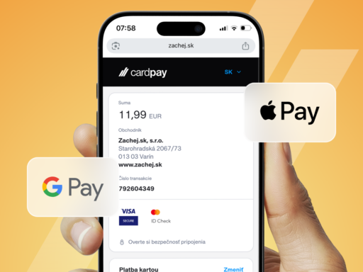
- Offer quick payment options like Apple Pay and Google Pay.
- Ensure clear CTA buttons and easy navigation.
- Optimize loading speed—studies show 53% of customers abandon a site if it takes longer than three secondsto load. Use optimized images, reduce unnecessary scripts, and leverage CDNs for faster performance.
Regularly test the mobile shopping experience by going through the full purchasing process to identify areas for improvement.
5. Remove Distractions
Banners, pop-ups, and excessive visuals can overwhelm customers. If a site feels cluttered, visitors quickly lose patience and leave.
How to create a smoother shopping experience?
- Use pop-ups strategically—display them when a customer is about to leave, not immediately after they land on your site.
- Make sure primary CTA buttons (e.g., “Buy Now,” “Proceed to Checkout”) stand out.
- Avoid unnecessary content that clutters the page.
Fewer distractions lead to a smoother shopping experience and higher conversions.
The Bottom Line: Simplicity Sells
- Don’t overwhelm customers with too many choices.
- If you have a large inventory, consider a multisite strategy.
- Simplify the checkout process—reduce steps and required fields.
- Prioritize mobile optimization.
- Eliminate distractions that could drive customers away.
E-shop optimization is an ongoing process—continuously improving the shopping experience will lead to better conversions over time. Try these tips and watch your sales grow.
Sources
- ShopIt Commerce: The Paradox of Choice in eCommerce
https://www.shopitcommerce.com/how-the-paradox-of-choice-affects-ecommerce/ - The New York Times: Jam Study (Journal of Personality and Social Psychology)
https://www.jstor.org/stable/26634013 - ConvertCart: Checkout Form Statistics
https://www.convertcart.com/blog/increase-ecommerce-conversion-rate - Red Stag: eCommerce Conversion Optimization
https://redstagfulfillment.com/ecommerce-conversion-rate/ - Monster Insights: eCommerce Optimization Tactics
https://www.monsterinsights.com/ecommerce-conversion-optimization-tactics/ - Baymard Institute: Best Practices for Product Variations
https://baymard.com/blog/product-list-usability - VWO: Reducing Choice Overload in eCommerce
https://vwo.com/blog/increase-ecommerce-sales-paradox/ - PracticalEcommerce: How to Simplify Product Choices for Higher Conversions
https://www.practicalecommerce.com/5-Ways-to-Reduce-Choice-Overload-in-Ecommerce - Smashing Magazine: UX Strategies to Overcome Choice Overload
https://www.smashingmagazine.com/2021/04/overcoming-choice-overload-ux/ - BigCommerce: The Paradox of Choice in Online Retail
https://www.bigcommerce.com/blog/paradox-of-choice/
FAQ about simplifying the buying process
Is it better to offer a wide range or fewer products?
More choices can actually overwhelm customers. Studies and experience show that a narrower, clearer selection helps people decide faster and buy with more confidence.
How do I know which products to keep and which to remove?
Analyze your sales – focus on bestsellers and the most searched products. Items that don’t sell well or confuse customers might be candidates for removal or hiding.
Does it make sense to create multiple shops if I sell different product types?
Yes, especially if you’re targeting different customer groups. Multiple smaller shops allow you to tailor design, messaging, and UX to specific audiences more effectively.
Why is the number of checkout steps so important?
Each extra step increases the risk that the customer won’t complete the purchase. The ideal checkout has 2-3 steps and only the necessary fields to fill in.
What are the most common mobile shopping mistakes that drive customers away?
Slow loading, unclear buttons, too many clicks, and lack of mobile payment options are among the top reasons why customers leave.
Are pop-ups useful or just annoying?
Pop-ups can be effective if used wisely – for example, when a user is about to leave or after some time on the site. It’s important they don’t disrupt the experience immediately.
What payment options should an online store support?
In addition to credit cards, the store should support mobile payments like Apple Pay, Google Pay, and express bank payments. The easier, the better.
Does personalization help increase sales?
Yes – showing recommended products based on past purchases or user behavior can significantly increase the chance of making a sale.
Why does my site feel slow only on mobile?
Mobile devices have different network conditions and performance. If your site isn’t optimized for mobile (e.g., large images, heavy scripts), loading slows down. Tools like PageSpeed Insights can help.