Web accessibility isn’t just about checking legal boxes – it’s about making sure everyone, regardless of their abilities, can use digital content without barriers. Creating an accessible site is a challenge, but also an opportunity to show your users that you truly care.
In this blog, we’ll walk you through how we improved accessibility on one of our health-related platforms, what tools we used, and which best practices you can apply to your own projects to make them more inclusive and user-friendly.
Why accessibility matters – and why it should matter to you
An accessible website can be used by people with visual, hearing, physical, or cognitive impairments. Starting in June 2025, accessibility won’t just be best practice – it will be legally required under the European Accessibility Act (EAA). You can read more about that in our blog dedicated to the topic.
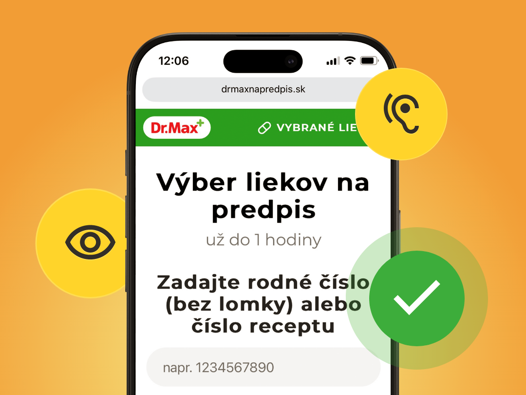
For this project, we focused on a website where accessibility truly matters – drmaxnapredpis.sk. Health-related platforms must be accessible to everyone, especially older users or people with disabilities who rely on digital access to vital information.
Accessibility in action
It all started with an accessibility audit. This gave us a clear picture of where we needed to improve and pointed us toward the first concrete steps. We focused on four key areas: semantic HTML structure, keyboard navigation, ARIA attributes, and color contrast.
1. Semantic HTML structure
First, we improved the HTML structure to make it more meaningful – not just for users, but also for assistive technologies like screen readers. We used semantic HTML5 tags to improve context and help both users and search engines better understand the content.
How to do it:
- Replace generic
<div>and<span>tags with semantic HTML5 tags like<header>,<nav>,<main>,<article>, or<footer>based on content type. - Ensure each page has a single
<h1>followed by logical heading levels (<h2>,<h3>, etc.). - Use
<label>tags with theforattribute in forms for clarity.
These changes create a clearer structure and enhance the experience for users relying on assistive tools.
❌ Before:

✅ After:

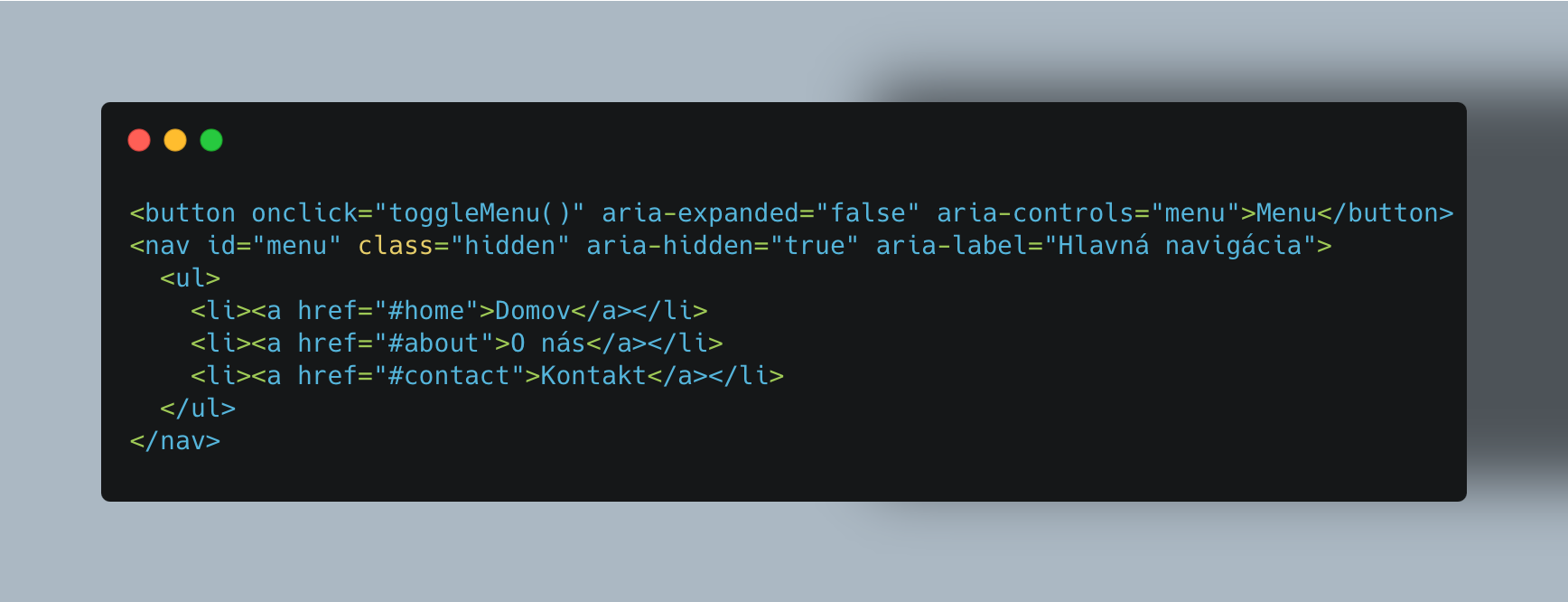
2. ARIA attributes
Dynamic elements like modals and dropdowns can be difficult for screen readers to interpret. ARIA attributes add extra layers of meaning that standard HTML doesn’t provide.
How to do it:
- Use
role="navigation"or<nav>to define main navigation. - Add
aria-live="polite"to notify users about dynamic changes (like updates in the shopping cart). - Use
aria-expandedandaria-hiddento indicate whether elements are visible or collapsed. - When clarity is needed, add
aria-labelfor a more descriptive label.
❌ Before:

✅ After:
3. Keyboard usability
Keyboard navigation is essential for users who can’t use a mouse. Ensuring that all interactive elements are accessible via the keyboard greatly improves usability.
How to do it:
- Make sure all interactive elements (buttons, links, form fields) are reachable with the TAB key. Use proper tags or
tabindexas needed. - For modals, shift focus to the modal when it opens, and back to the page when it closes. Use JavaScript to keep the focus contained within the modal.
4. Color contrast
Strong color contrast is crucial for users with low vision or color blindness. If the contrast is too weak, content becomes hard to read and navigate.
How to do it:
- Maintain a minimum contrast ratio of 4.5:1 (WCAG 2.2 AA standard).
- Avoid pastel or low-saturation color combinations.
- Visually differentiate links and buttons on hover.
- Keep text sizes readable – at least between 9px and 12px.
5. Testing matters
To ensure that our changes actually worked, we tested them using several tools. Here are the ones that helped us the most:
- Firefox Accessibility Inspector: A fast and easy way to check accessibility directly in the browser.
- ARIA DevTools: Offers a view of your site structure from the ARIA perspective.
- Silktide: A comprehensive tool covering everything from color contrast to section structure.
Accessibility is a journey, not a destination
Improving the Dr.Max prescription website taught us that accessibility isn’t a one-time task – it’s a continuous process. From semantics to testing, every step brought us closer to a website that truly serves everyone. We see accessibility as a core part of building high-quality digital products, and we’ll continue integrating it into all our projects to make sure they’re usable and inclusive by design.
FAQ: Web Accessibility in Practice
What does it mean for a website to be accessible?
An accessible website is one that can be used by everyone — including people with visual, auditory, physical, or cognitive disabilities. It includes proper HTML structure, keyboard navigation, readable color contrast, and well-implemented ARIA attributes.
Why should I care about accessibility if I don’t work in the public sector?
Starting June 2025, the European Accessibility Act (EAA) will apply to many commercial websites — including e-commerce, banking, and healthcare portals. Accessibility also improves UX and expands your reach to a wider audience.
What are the first steps to improve accessibility on my website?
Start with an accessibility audit to identify critical issues. Then focus on improving semantic HTML, enabling full keyboard navigation, enhancing color contrast, and adding ARIA attributes for dynamic elements like modals or dropdowns.
What tools can I use to test accessibility?
Commonly used tools include Firefox Accessibility Inspector, ARIA DevTools, Silktide, and axe DevTools. Each one helps detect different accessibility issues — from structure to contrast to dynamic behavior.
What if I don’t have an accessibility expert on my team?
Start with small improvements — clear HTML structure, tab navigation, and visible contrast already make a big difference. You can also rely on external audits or consultations to set a good foundation for your team.