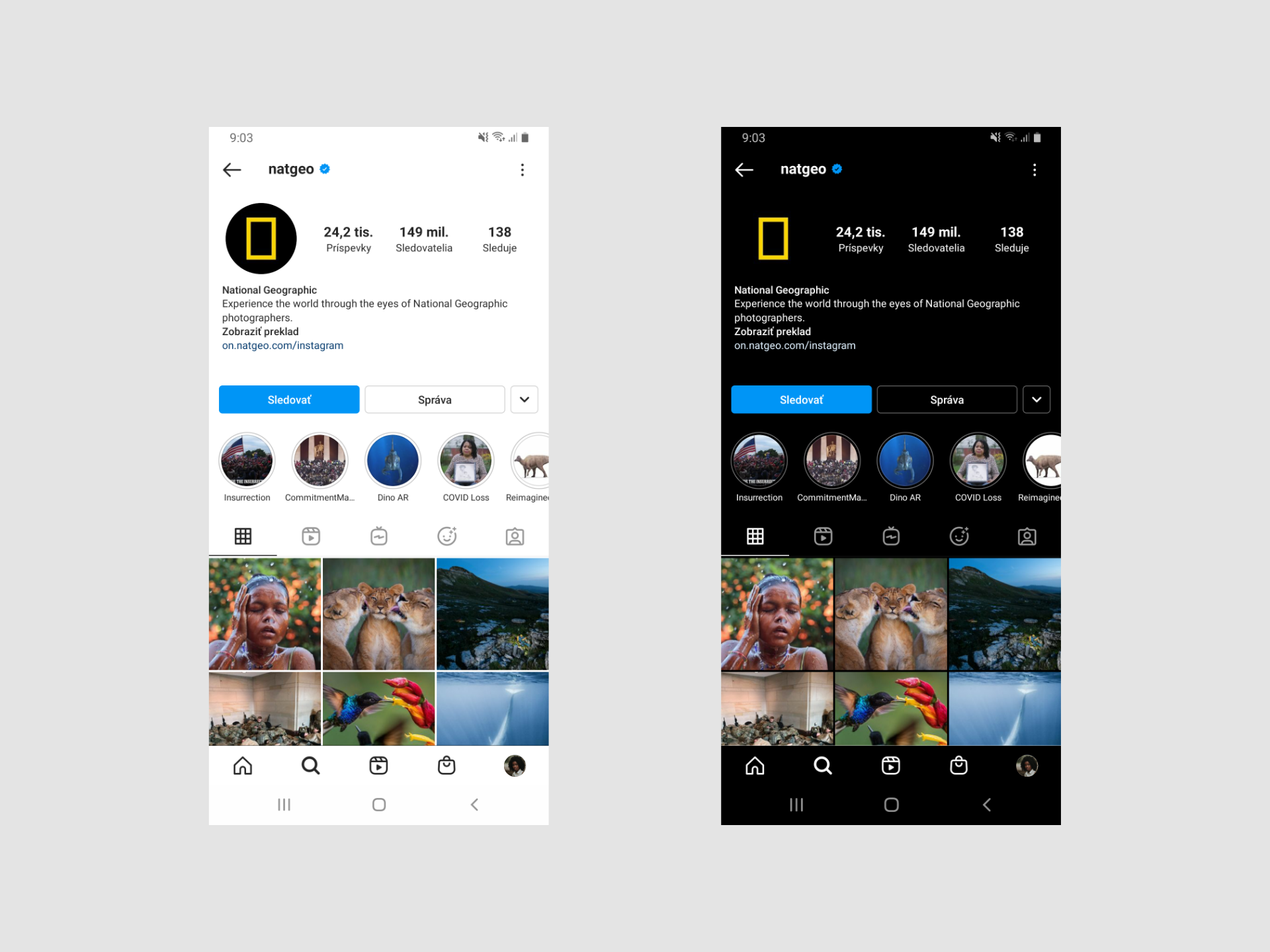
Dark user interfaces have become very popular with users over the last few years. We can see how some of the most popular applications and services like Android, MacOS, Spotify, Instagram and Netflix have been designed with dark mode in mind.
Let’s talk about what factors you should consider when choosing between a dark user interface and a light user interface and what is best for your users.
What to focus on when deciding between dark or light interface
Deciding for a dark interface is often based on personal preferences rather than a thorough understanding of what is right for the product. But the decision between dark or light interface should be well thought out. Instead of assuming what’s right for your product, you might want to answer the following questions:
What is the goal of your product?
Will it be a product based more on the visual or on the text?
At what time will your product be used the most?
Legibility of the text
The amount of textual content is one of the determining factors of your basic decision. A light background is recommended for large blocks of text. Especially if users are expected to spend more time reading the text. That’s one of the reasons why most news portals mostly use a white background.
Conversely, a dark background can be the right choice for visually appealing products that don’t require a lot of text. The main advantage is that such a user interface focuses the user’s attention on the visual.
User environment
When we talk about the user environment, we don’t only mean where the user uses your product, but also when they use it. As you might suspect, a dark user interface is mostly suitable for products that are used in the evening or at night. Vice versa, a light user interface is suitable for daily use.
Most entertainment services, such as Netflix, tend to choose a dark interface due to the fact that most entertainment activities take place mainly in the evening.
What’s better for the eyes?
White text on a black background causes the eye to strain more and the pupils have to open more because they need to absorb more light. In this case, the white letters may appear to blend into the black background, making the text blurry.
However, the fact that dark mode can reduce eye strain in low light should also be taken into account.
In principle, dark mode is recommended if you use the product in low light or if you don’t plan to read the text for too long.
Switching between dark and light mode
In some applications, you may find that the system decides for you when to automatically switch to dark mode. This usually happens in later hours, when the application could dazzle the user too much. E.g. a car navigation.
The second approach you can choose is to let the user decide which mode to use based on their personal preferences.
Conclusion: Dark or light?
In general, the dark interface is better used wherever there are more visual elements and less text. For example movie watching services or playing video games.
Conversely, it’s better to use a light interface if your product is used mainly during the day. Also if most of your content is text-based.
Before you decide on one or the other solution, you should clearly understand not only the advantages but also the disadvantages of each interface and whether they are suitable for your content. That’s why it’s necessary to understand your users and decide on the basis of what will be the best solution for them.