Good navigation must be intuitive and easily predictable. Both old and new users should be able to navigate the application quickly and easily.
As mobile devices are limited by screen size, creating clear navigation is often a challenge.
Different types of navigation try to address this challenge in different ways, but they all have their pros and cons. Let’s outline 3 basic types of navigation and describe their strengths and weaknesses.
Hamburger menu
On small screens, every pixel is precious and exactly because this type of navigation helps save space, it’s one of the most popular types. The hamburger menu allows us to hide the navigation and show it only if the user needs it.
This navigation can also be useful in case we want to direct users’ attention to the content.

source: https://dribbble.com/shots/4418730-Mobile-menu-interaction
Advantages
- Quantity of items. The main advantage of this navigation is that it can contain a large number of items.
- Clean design. Thanks to the fact that the navigation is hidden, it helps us save space and the design looks cleaner.
Disadvantages
- Hidden navigation is easier to overlook. If navigation is hidden, users might use it less. Although this type of navigation is becoming standard and is not a problem for most people today, there are still those who don’t know that it’s necessary to click on the icon to display the navigation.
- At first glance, it is not clear where the user is located. The user doesn’t get this information until he clicks on the icon that shows him the navigation.
- Extra click. Requires at least two clicks. One click on the icon and the other on the target page.
Navigation bar
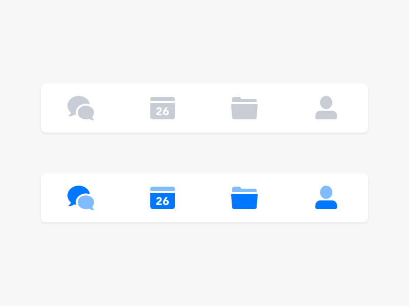
This type of navigation is based on the design of a desktop. It usually contains relatively few items but it allows direct access from anywhere in the application.

source: https://dribbble.com/shots/4617611-Mobile-Navigation
Advantages
- Informs me where I am within the application. This navigation informs the user quite well about where they are currently located within the application.
- Just one click. All navigation options are constantly displayed, therefore users have an overview of all the main parts of the application and they have access to them with a single click wherever they are.
Disadvantages
- Limited number of items. If your app contains more than 5 items, it’s difficult to display them while ensuring the optimal button size for a convenient click.
Gesture-controlled navigation
Gestures help users navigate between views, perform actions and manipulate with content. Among other things, they make it simpler for users to move easily in the application and free the user interface from unnecessary buttons and navigation elements.

source: https://dribbble.com/shots/4264905-Music-Player-Interaction
Advantages
- Design with emphasis on content. Creating a gesture-based application will allow you to create a more minimalist user interface and thus gain space for more valuable content.
- Instinctive user interface. Luke Wroblewski in his article provided information about a study in which 40 people from 9 different countries were asked to create gestures for 28 different tasks, such as delete, scroll, zoom, etc. It’s important to note that the gestures were similar across different cultures and user experiences. E.g. when prompted to ‘delete’, most respondents, regardless of the country they came from, tried to move the object off the screen.
Disadvantages
- Invisible navigation. As this type of navigation is not visible, usability issues may occur. Different interactions are hidden behind different gestures and users must find them first.
- Need to get acquainted with the application. At the beginning, users need to make more effort to become familiar with the application.
Conclusion
Think about your target audience and the goals they have when using your application and use navigation to help them achieve those goals. The easier it is to use the product, the more likely the users will come back to it again.


