What is a heatmap?
A heatmap is a graphical representation of data that helps designers visualize user behavior and better understand how they work with the web. Heatmap records data when a user interacts with your site, either using a mouse or by tapping a touch screen.
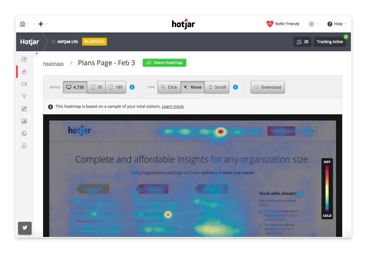
Heatmap allows us to collect information such as:
- Number of clicks
We’ll find out where and how often users click within the site. Alternatively, we will detect places where users don’t click and use this space more efficiently. - Mouse cursor movement
Thanks to tracking the movements of the mouse cursor, we can identify whether the user is confused on your site. Does the user move the cursor randomly across the web? Something may be distracting them. Is there a place with high motion density? Maybe that’s where they’re looking for more information. - Scrolling
We will find out how many users scroll to the bottom of the page and where most of them end up. This will help us rethink the layout of the elements on the web and also see whether it’s appropriate to move important elements slightly higher.
Why use a heatmap?
Heatmap allows us to collect a lot of useful data thanks to which we can understand the behavior of users on your site better. Using a heatmap, we can test individual elements, such as…
- Buttons: Location, size, style
- Navigation: Menu, links
- Images: Location, size, type, links
- Text: Location, formatting, text length
- Overall layout: Hierarchy of information
With the help of a heatmap, we can detect various problems and thus avoid their recurrence. Unlike the various satisfaction surveys that appear in pop-ups, heatmaps work in the background without compromising the user experience.
5 examples of using a heatmap
1) Do users click on the call-to-action buttons?
Heatmap: Number of clicks
Problem: Do your call-to-action buttons have the most clicks? If not, where do your users click most often? Which elements distract them from clicking on the call-to-action button?
Solution: One solution is to move the call-to-action button to the place where users naturally click most often. We also recommend eliminating any elements that might distract users from clicking on the call-to-action button, or putting more emphasis on the call-to-action button.
2) How far do your users scroll?
Heatmap: Scrolling
Problem: At what point do users stop scrolling most often? Is there important information below this point? Is there a “fake” bottom on the page where users think the page ends and so they don’t move on?
Solution: Move important elements above the average point where users stop scrolling and remove any distractions or confusing elements that discourage users from scrolling. Alternatively, consider creating multiple shorter subpages.
3) Identify “fake” clicks
Heatmap: Number of clicks
Problem: Which non-click elements do users click on most often? Do users click on images or elements that look like buttons?
Solution: Create links to properly direct users. Adjust irrelevant elements so that they look less “clickable”.
4) Find out what distracts users
Heatmap: Moving the mouse cursor
Problem: Are your users moving the mouse cursor across the whole webpage in confusion? This could mean that they are frustrated that they cannot find the information they need.
Solution: Remove elements that unnecessarily attract attention so that users have a clear orientation on each page.
5) Compare user behavior by device type
Heatmap: Number of clicks and scrolling
Issue: Are your conversions from mobile devices lower than those of desktop users? Do mobile users behave differently?
Solution: By gaining this data, we can understand user behavior better, therefore we can optimize your site for different devices, such as mobile or tablet, more effectively. This will allow us to ensure a better user experience on all devices.
Conclusion
In the world of design, trends are constantly changing, user needs are evolving and what was true yesterday may not be the case tomorrow. However, one thing remains the same. Knowing more about the users we design for is key to improving and optimizing our work.
Heatmaps are a great way for us to continually improve the user experience through better design.